Production
[Notes regarding production practice]
corporate diagrams — The conventions below for shapes and lines are generally followed in diagrams of corporate transactions.
Line weights = 0.5 pt (usually); arrows = Illustrator #9 at 140%; common weight/dash/gap patterns = 0.5/2/2; 0.5/1/1; 1/0/2.
| Entity | Shape (with white fill) |
| Corporation (any type) | Rectangle or square |
| Partnership (any type) | Oval |
| Limited liability company | Triangle within rectangle |
| Trust (any type) | Triangle |
| Individual | Label alone |
| Relationship/action or border | Line/arrow style |
| Ownership | Solid line |
| Action (e.g., payment of dividend) | Arrow |
| Differentiated ownership or action (e.g., disregarded entity; secondary transaction) | Dashed line or arrow |
| Border between jurisdictions | Solid line, wider than entity grouping |
| Label | Alignment/position |
| Entity | Centred vertically and horizontally within entity shape |
| Vertical relationship/action or border | Positioned 6 pt to left or right of line/arrow; centred vertically |
| Horizontal relationship/action or border | Positioned 3 pt above or below of line/arrow; usually centred horizontally |
footnotes, continued — If pages and footnotes fall such that the ultimate footnote must appear entirely on the next page, or such that the penultimate footnote on the page has to be continued to the next page and the ultimate footnote must appear entirely on the next page, add the following note, as required, flush right, below the last line of the footnote on the start page:
(Footnote X appears on the next page.)

(Footnotes X and Y are continued on the next page.)
running heads — In CTF CRs, the left running head shows the authors of the paper in all caps. (1) In an author name that combines uppercase and lowercase letters (e.g., McKay), style the lowercase letter(s) between uppercase letters as small caps. (2) In multi-author papers, the preferred display of names as shown on the title page is as follows. Where the fourth, least preferable option is too wide, consult with the CTF.
- [default] all names, including honorifics such as "Hon.", with "and" preceding the final name
- all surnames, including honorifics, with "and" preceding the final name
- all surnames, omitting honorifics, with "and" preceding the final name
- all surnames, omitting honorifics, with "&" preceding the final name
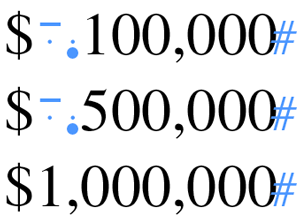
tables, alignment of data — (1) Align text on the left, or centre text where the text is very brief. (2) Align decimal numbers on the decimal with a decimal tab. (3) Align whole numbers on the right digit with a right tab, or use a centre tab and add en spaces for digits (![]() ) and quarter spaces for thousands commas (
) and quarter spaces for thousands commas (![]() ) to manually align numbers:
) to manually align numbers:
tables that extend over two or more pages — When a table is too large to fit on a single typeset page, it is continued on the next page or pages. At the foot of the first page, a single full-width hairline rule is placed below the last row of figures appearing on that page, followed by one of the following two notes in roman type, written in parentheses and centred under the rule: "(Table 1.6 is continued on the next page.)" or "(Table 1.6 is concluded on the next page.)" The corresponding wording in French is "(Le tableau 1.6 est continué à la page suivante.)" or "(Le tableau 1.6 est terminé à la page suivante.)" The remainder of the table is set out on the next page or pages, under a modified title that reads "Table 1.6 Continued" or "Table 1.6 Concluded." The corresponding wordings in French are "Tableau 1.6 (suite)" and "Tableau 1.6 (fin)." This title is set flush left and is followed by a single full-width hairline rule. All column headings are repeated. Footnotes to "continued" tables and source notes appear at the end of the table. (First published by the Canadian Tax Foundation.)
URLs, breaking — If a URL has to be broken at the end of a line, the break should be made
- after a double slash or a single slash;
- before a tilde, a period, a comma, a hyphen, an underline, an at sign, a question mark, a number sign, or a percent symbol; or
- before or after an equals sign or an ampersand.
A hyphen should never be added to a URL to denote a line break, nor should a hyphen that is part of a URL appear at the end of a line. If a particularly long element of alphabetic characters must be broken to avoid a seriously loose line, it should be broken between syllables according to general word division rules. (First published by the Canadian Tax Foundation.)